We've designed & developed
a powerful email marketing tool
To create a visually stunning, friendly, intuitive and smooth interface for robly.com and
to develop a cutting-edge Javascript based email template
with a Drag and Drop editing tool.

We determined the core goals and problems that were associated with the project by thoroughly researching Robly’s business and end-user needs. Robly’s core mission was to provide a smooth email marketing tool as well as seamless integration with its customer review platform.

We established the main challenges that Robly.com would face when it came to design, front-end and Javascript development. These were: a tight deadline, a high innovation factor and the colossal scope of the project.

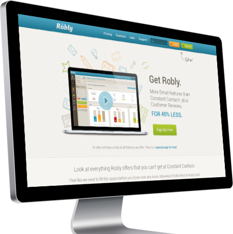
The goal was to launch the Robly.com website precisely to their specification list and ensure it was fully tested internally. We achieved this by performing excellent team communication and efficient time management.

Two of the core functionalities of Robly were that email marketing and reviews had to go hand-in-hand from an end-user perspective. We accomplished this by creating highly intuitive user interfaces.
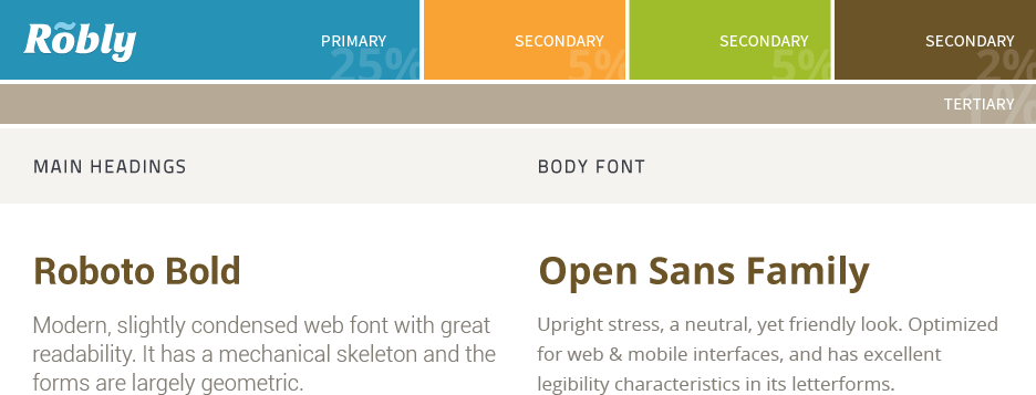
We developed a brand, colour palette and determined the best font choices for the client based on their creative vision and target audience. The blue, orange, green and brown shades were chosen to differentiate between different actions users could perform.


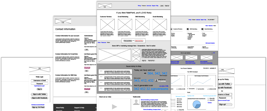
We began the creative process by presenting wireframes to the client. This allowed us to work comprehensively on user interactions and user flow patterns.

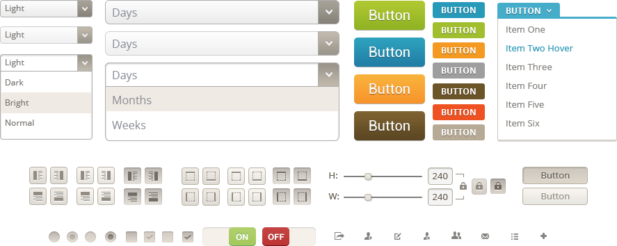
A whole bunch of icons and effects were created and tried out before finally being put forward to code. Many sprites and buttons that were tested we later found to be visually appealing on the interface.

We created over 600 individual UI elements that were used on the Robly website design. All elements needed to be pixel perfect, sharp, of uniform and inter-changeable sizes and colours. Each colour indicated the type of action to be taken: blue to save, green to move on, yellow for calls to action and brown for extras.
We worked extensively on HTML/CSS to ensure all code was standards compliant and utilised modern working approaches. We also had to manage class names and id’s to easily integrate them into the Ruby development.

The Robly.com website is scheduled for launch to the public after a final round of external testing. Get ready for the next big thing in email marketing!
“Robly spent 14 months in development developing a platform that offered a suite of marketing products to small businesses and organizations. Different parts of the product were developed in New York, California, India, the UK, and Romania. We were connected with The House Media through our freelance UI/UX expert.
We hired them to do all of our HTML and CSS work for Robly, and contracted them to build a drag-and-drop email builder, both were stellar.
Every work product we received from The House Media was of the highest quality. They were also very realistic with forecasting and hit deadlines. All-in-all, it was a very positive experience, and I would recommend them to anyone.”
Adam Robinson, CEO